Introduction
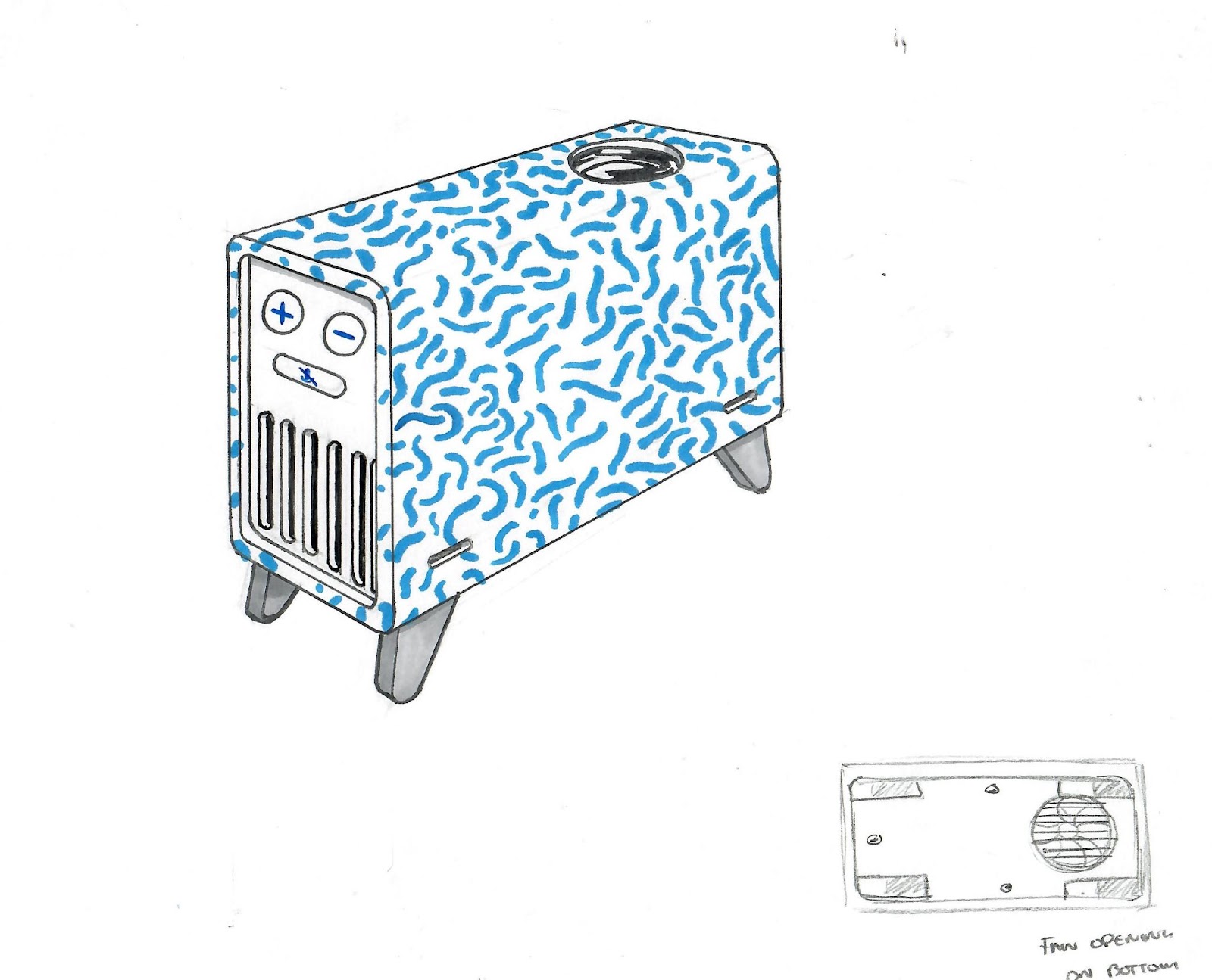
As the year comes to an end, we are feeling nostalgic over here at Tomorrow Lab! And we thought what better way to feed into our nostalgia than revisiting some old sketches from projects past. While going through old sketchbooks around the TL office, we could not help but fall in love all over again with these products!
Project 1 – Jules
We were ahead of our time with this one! Jules is an extremely cute Artificial Intelligence (AI) enabled speaker with an integrated projector. It’s designed to teach and entertain kids in unique ways. The client wanted a small device that would represent a friend who would help the child transform their bedroom into an imaginative and interactive personal space.
These early sketches are so adorable and have so much character! It is clear the Tomorrow Lab team had a lot of fun personifying this tiny projector. I personally love the whale sketch in the top center of the sketch page above and to the right. I like to imagine a tiny fleet of these on a child’s shelf, each character evoking a different emotional state; for example the whale could be used as a calming device with scenes and sounds of the ocean.
In Tomorrow Lab’s design process, it is so important to take the time for ideation, letting creativity flow and seeing what can come of letting your mind wonder. All of these sketches are a window into the designer’s thought process – exploring whether the product should be talking furniture, an abstracted character or a fully developed character. Form is also explored through themes like zoology, space exploration and emotional response to form. Ultimately, the form that was decided upon was an abstract alien-like companion that takes users into the stars, with a form that embodies both a spaceship and an astronaut. Cute right?
Other considerations for Jules were tones and voice options, as well as the entire user experience. The biggest challenge after the initial industrial design was the mechanical product architecture. The challenge was to balance the computing needed in the product and what could offload to a companion device like a phone or tablet. It was also a challenge to fit all key components like the projector, speaker and beagleboard into the device seamlessly. The final results still feel relevant in the present day, with all the new AI advancements we have seen just in the past year. For more on how AI can shape product design and development, check out our article on just that here.
Project 2 – Beam
Project Beam is one of our most beloved, and longest TL projects to date! Every step of this project was enjoyable, ambitious, intricate and oh so rewarding. Our client, a practicing dentist, Dr. Keith Arbeitman came to TL with his idea of a toothbrush that brushes all your teeth at once! While these products have indeed existed in the market, none actually delivered the results they claimed to – and Keith was on a mission to solve this gap.
These early sketches of the brush sans bristles show some of the feature considerations that were being contemplated. The TL’er that sketched these excelled both in industrial design and mechanical engineering, whose process is highlighted very well in this visual form. You can see in this sketch that the designer was focusing on functionality of the device by way of handling the device through different features like LED lights, touch sensors, button release to change out the bristle tray, while paying attention to where the battery and motor might live.
In this sketch, a whole other form is explored, focusing on circular and organic shaped elements. There are interesting callouts like in the center sketch where it says “easy to grab,” which implies that that area is textured for better grip. A giant power button on the face of the device stands out, with a large LED ring indicating when the device is ready to use.
A later sketch, from the lead mechanical engineer on the project, helps to show some of the product’s internal architecture and calls out the adjustable duration of the device. It is interesting seeing a mid-project sketch and comparing it to the final product. Much of what is seen here looks incredibly similar to the final design. The overall architecture did not change much from this point, along with the form of the bristle cradle. There is a note of the exterior having a silicone sleeve for user comfort, while the interior housing should be rigid, to provide a study base to assemble the necessary components onto.
The final design looks very sleek. You can even trace some of the form to the earliest sketches. The bristles themselves had just as much attention paid to them as the rest of the design. Through many iterations, factory sourcing and testing, the patented brush features a folding bristle tray that pops in and out of its connected tray. The bristle tray moves back and forth while vibrating, to brush every tooth all the way around. While this experience may sound intimidating, we promise it will provide the most effective, and quickest brush of your life!
You can own your very own full-mouth cleaning device, through Arbeitman’s direct to consumer site, where he dubbed his device as the SymplBrush. And if you have an idea for a new hardware product in the emerging Artificial Intelligence or Health and Beauty space (or, really any space!), get in touch with us here for a free consultation!

